

Last year I wrote quite a bit about the benefits of artists moving their cvs to a digital format such by using an online service such as artistcv.artbiogs.com. Once your exhibition history is in a data sharing format you can take advantage of all sorts of visualising applications. The advantages of creating a cv so that it can be incorporated into a dataset are two immediate benefits.
- Your exhibition history is portable and searchable by any institution that supports databases - pretty much every museum & gallery
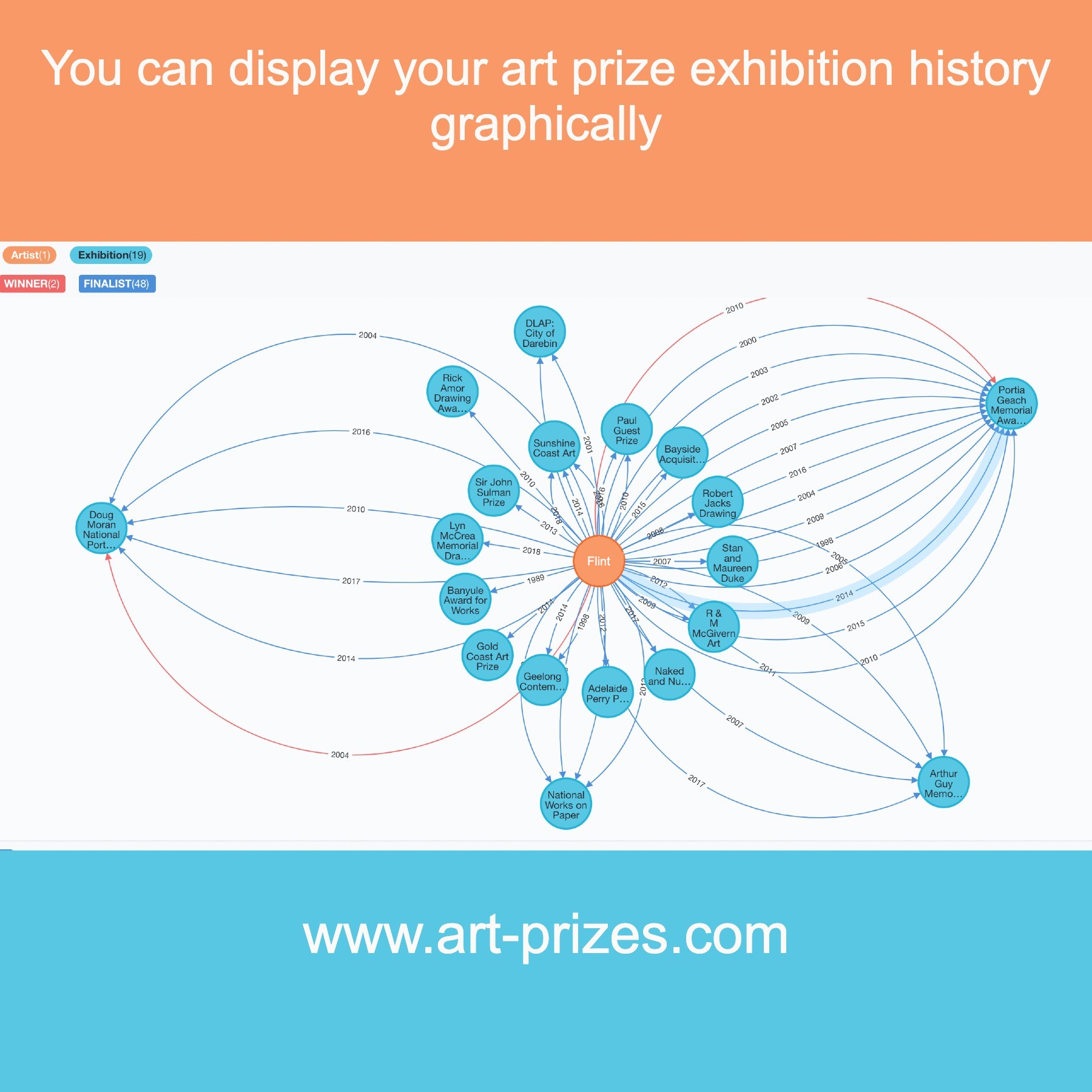
- Your exhibition history can be rendered by all sorts of dataset visualisers. In this example I’ve used data from our finalists’ dataset and then used Neo4j to render it graphically. And I think it looks amazing in this visual format.The graphic makes It is so easy for curators and prize administrators to read and understand your exhibition history.
For those that want to experiment with artistcv.artbiogs.com you need to just ensure your cv is formatted so that:
- It is yyyy, title, venue, city/country (for example: 2020, myexhibition, fab gallery, Adelaide, SA)
- Or title, venue, city/country, yyyy
- any other format probably won't scan that well
Try it out and let me know how it worked for you. Once you've run it through our conversion send me an email to hello@artbiogs.com and I'll send you the graphic, based on your prize exhibition history. Before you do, just make sure that you have a few to many art prize exhibitions in your cv as that is the data we are converting to the graphic.
Just note that our software is still in beta so it isn’t as robust as a production ready application.
Why would you want to show your exhibition history as a graphic rather than streams of text? For a start it is so much easier to read as a graphic than words and letters in a cv and secondly this map is actually a dataset and can be used for exchanging information with other parties. Right now noone is really asking for it but it won't be long before they will be.
The graphic below is a visualisation of art-prize finalist exhibitions for Flint and not her entire exhibition history. But even so it shows in such an effective manner all the prize exhibitions the artist has had and it also quickly identifies repeat entries for the same art prize.
If the exhibition history is displayed in chronological order, descending, as in a cv, you fail to get a sense of the number of times the artist has been repeatedly selected for several prizes. Also worth noting is that the red line indicates the artist won the selected prize. Again, everything is evidence in just a glance.
Art-Prizes has the largest dataset of finalists and winners in Australian art prizes and can generate a graphic like this for many artists. Click here o watch a brief 3 minute video about how your prize exhibition history can be quickly discovered.
We may be able to make a similar graph for you, if you've been displayed in a number of art prize exhibitions.
Here is an example of how your prize history could be displayed: